Documentation Index
Fetch the complete documentation index at: https://docs.onghost.com/llms.txt
Use this file to discover all available pages before exploring further.
✨ Styling Emails with the Side Panel
The side panel in the Mintlify Email Editor gives you full control over the look and feel of your emails. Here’s a breakdown of each section and how to use it to match your brand or message style.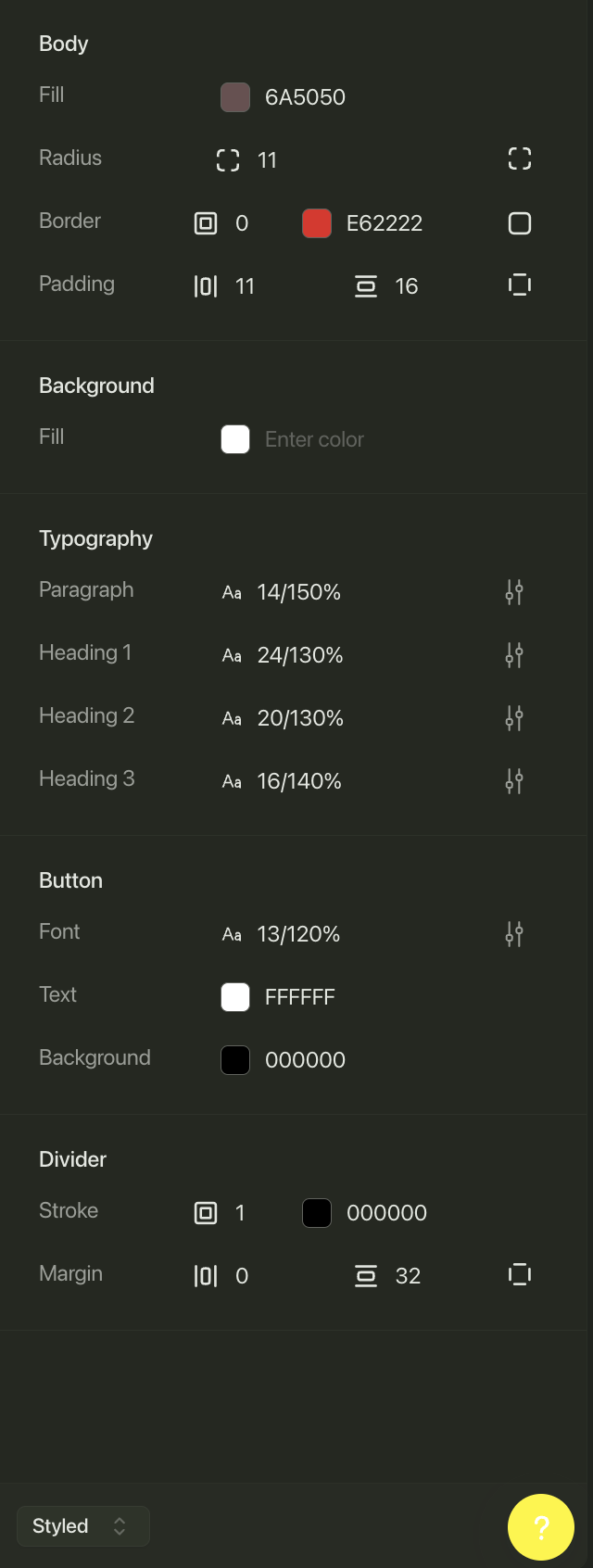
🧱 Body
Customize the outer container of your email.- Fill: Sets the background color of the email body (e.g.
#6A5050). - Radius: Controls the corner roundness (in pixels).
- Border: Add a border with thickness and color (
#E62222in the example). - Padding: Set spacing inside the body (top/bottom and left/right).
🎨 Background
This option allows you to set a background color for the full email canvas, beyond the body container. Click the color input to choose or paste in a hex code.🖋 Typography
Adjust text sizes and line heights for all major text elements in your email.- Paragraph: Default text style (e.g.
14px / 150%). - Heading 1, 2, 3: Set sizes and spacing for each heading level to define hierarchy.
- Click the sliders icon to fine-tune or reset each style.
🔘 Button
Control the appearance of all buttons used in your email.- Font: Set the text size and line height (e.g.
13px / 120%). - Text: Choose the button text color (e.g.
#FFFFFF). - Background: Select the button fill color (e.g.
#000000).
➖ Divider
Style horizontal lines used to separate content sections.- Stroke: Set the line thickness and color (e.g.
1px / #000000). - Margin: Control spacing above and below the divider (e.g.
Top: 0,Bottom: 32px).
⚙️ Styled vs Plain Mode
At the bottom of the panel, you’ll see a toggle labeled “Styled”. Click this to switch to Plain mode.💡 Plain mode sends emails with no visual styling—just raw HTML or text. These are ideal for transactional or high-deliverability needs, such as confirmations, password resets, or simple outreach. Use when minimalism and inbox reach matter more than design.